Label
November 13, 2022
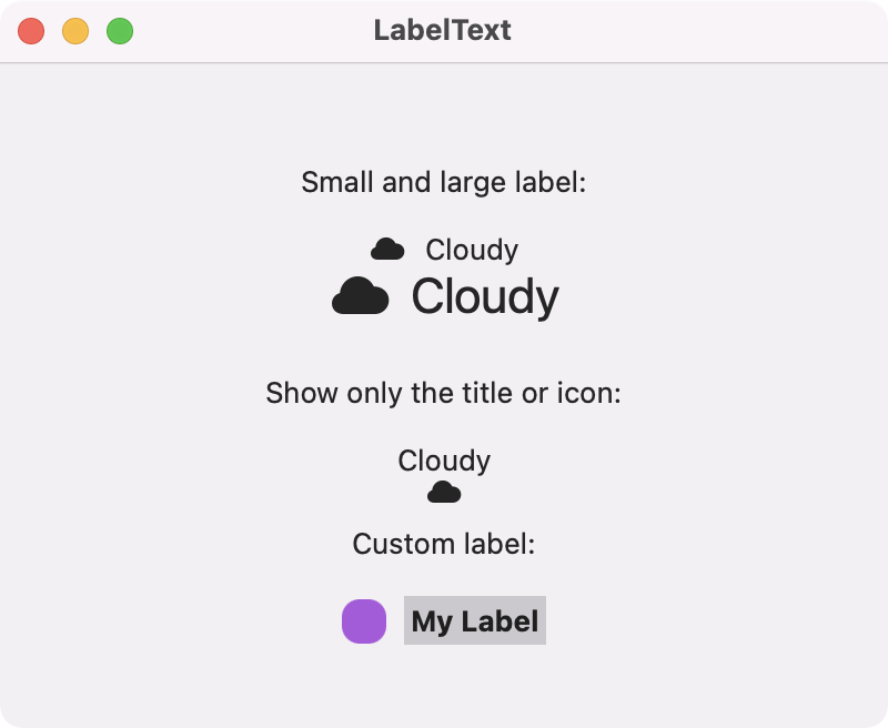
Use a Label to show text and an icon side by side. The icon can be either an SF Symbol or your own image. The label can be scaled with the font modifier. A completely custom label can be created using custom views for the text and icon.
import SwiftUI

struct ContentView: View {
    var body: some View {
        VStack {
            Text("Small and large label:").padding(8)
            Label("Cloudy", systemImage: "cloud.fill")
            Label("Cloudy", systemImage: "cloud.fill").font(.title)

            Text("Show only the title or icon:").padding(8)
            Label("Cloudy", systemImage: "cloud.fill").labelStyle(.titleOnly)
            Label("Cloudy", systemImage: "cloud.fill").labelStyle(.iconOnly)

            Text("Custom label:").padding(8)
            Label {
                Text("My Label").font(.headline)
                    .padding(3)
                    .background(.gray.opacity(0.4))
            } icon: {
                RoundedRectangle(cornerRadius: 8)
                    .fill(.purple)
                    .frame(width: 20, height: 20)
            }
        }
        .frame(width: 400, height: 300)
    }
}
Swift Programming for macOS © 2025
Built with Genja by Gavin Wiggins