Heat Maps with SwiftUI and Charts
Published on July 8, 2023
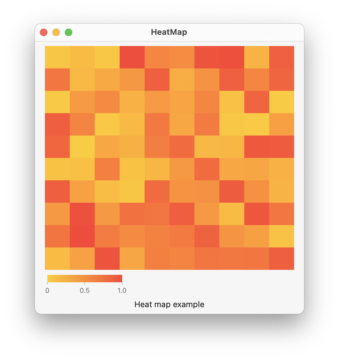
Use a RectangleMark() in a Swift Chart to create a 2D heat map of data. In this example, the data is represented using a Grid struct that contains an array of Point structs. The Point struct defines the x and y coordinate of the associated value. The x coordinate is a range based on the number of columns, the y coordinate is a range based on the number of columns, and the value is a random number from 0 to 1. Faint lines may appear on the chart if the frame size is not evenly divisible by the number of rows and columns defined by the Grid struct; this is likely caused by each RectangleMark() not perfectly aligning to the screen pixels.

import SwiftUI
import Charts

struct Point: Hashable, Identifiable {
    let id = UUID()
    let x: Int
    let y: Int
    let val: Float
}

struct Grid {

    let rows: Int
    let columns: Int
    var points = [Point]()

    init(rows: Int, columns: Int) {
        self.rows = rows
        self.columns = columns
        generateData()
    }

    mutating func generateData() {
        for i in 0..<rows {
            for j in 0..<columns {
                let v = Float.random(in: 0...1)
                let point = Point(x: j, y: i, val: v)
                points.append(point)
            }
        }
    }
}

struct ContentView: View {

    @State private var grid = Grid(rows: 10, columns: 10)

    var body: some View {
        VStack {
            Chart(grid.points) { point in
                RectangleMark(
                    xStart: .value("xStart", point.x),
                    xEnd: .value("xEnd", point.x + 1),
                    yStart: .value("yStart", point.y),
                    yEnd: .value("yEnd", point.y + 1)
                )
                .foregroundStyle(by: .value("Weight", point.val))
            }
            .chartYAxis(.hidden)
            .chartXAxis(.hidden)
            .chartForegroundStyleScale(range: Gradient(colors: [.yellow, .red]))
            .frame(width: 400, height: 400)

            Text("Heat map example")
        }
        .padding()
    }
}
Gavin Wiggins © 2026
Made on a Mac with Genja. Hosted on GitHub Pages.